

6 Patriotic Color Combinations Designers Can Copy Now
Six palettes cover almost every patriotic design need: Classic American, Softer Patriotic, Blue-Red-White Balanced, American Patriot, a bright high-contrast set, and a coastal-formal, muted trio. Each pairs a version of Code Red (#B42033), Royal White (#FEFEFE), and Pastel Dark Blue (#3C3B6E) with supporting neutrals.
- Classic American — #B42033, #FEFEFE, #3C3B6E, #CECECE — best for branding and logos
- Softer Patriotic — #940f15, #ebead9, #a4b6c1, #2e598f, #0c2141 — best for interior decor and apparel
- Blue-Red-White Balanced — #3C85C4, #EEF1F1, #CA565A — best for digital UI
- American Patriot — #B34B42, #DAC2A2, #EDEEE2, #3E4B90 — best for print and stationery
- Bright Classic — #FF0000, #FFFFFF, #0000FF — best for high-visibility exterior signage
- Formal Muted — Liberty Blue tones with warm ivory — best for event apparel and trim
Key Takeaways
Balanced patriotic color combinations depend on treating white as the dominant interval, muting red and blue, and applying a 60:30:10 ratio across the design.
| Point | Details |
|---|---|
| Start with white | Use white or warm off-white as roughly 60% of the palette to separate red and blue. |
| Mute your primaries | Swap fire-engine red for brick or oxblood and royal blue for navy to avoid a costume look. |
| Match production values | Confirm hex, RGB, CMYK, and Pantone equivalents before printing, since screen and print colors shift. |
| Keep red as an accent | Reserve bright red for small, high-impact areas like patches, stitching, or trim. |
| Shop it ready-made | Warbeardproject applies these muted, veteran-focused palettes directly to apparel like the new logo yoga leggings. |
Table of Contents
- Six Patriotic Color Combinations With Hex Codes for Every Project
- How to Balance Red, White, and Blue Without It Looking Like a Costume
- Hex, RGB, CMYK, and Pantone Values for Production
- Applying Patriotic Colors to Veteran-Focused Apparel
- Get Patriotic-Themed Apparel Without Designing It Yourself
- Frequently Asked Questions
- Sources
Six Patriotic Color Combinations With Hex Codes for Every Project
These six palettes cover the range designers actually reach for, from bold branding to interior accent walls. Each includes exact hex values and a suggested 60:30:10 ratio (dominant color to secondary to accent) so the combination stays balanced instead of looking like a flag draped over a product.
1. Classic American uses Code Red (#B42033), Royal White (#FEFEFE), Pastel Dark Blue (#3C3B6E), and Vibrant Silver (#CECECE) as a neutral bridge. This is the go-to for logos and heritage branding where you need instant recognition without looking dated.
2. Softer Patriotic trades primary brightness for depth: #940f15 (a muted brick red), #ebead9 (warm off-white), #a4b6c1 (dusty blue-gray), #2e598f (mid navy), and #0c2141 (near-black navy). This five-color set works especially well for interior decor and apparel that needs to read sophisticated rather than seasonal. Let the two navy shades anchor the palette while the off-white does the heavy lifting as background.
3. Blue-Red-White Balanced keeps things simple with #3C85C4 (a friendlier sky blue), #EEF1F1 (cool off-white), and #CA565A (a dusty rose-red). White here acts as the interval that keeps blue and red from visually fighting, which makes this trio a strong pick for UI design, app icons, or anywhere you need clean digital contrast without harsh primaries.
4. American Patriot offers a fully muted alternative: Apple Blossom (#B34B42), Champagne Beige (#DAC2A2), Feta (#EDEEE2), and Ada (#3E4B90). It’s built for print materials and stationery where subtlety matters, think invitation suites, packaging inserts, or veteran memorial materials where a loud red-white-blue combo would feel out of place.
5. Bright Classic is the palette most people picture first: pure #FF0000, #FFFFFF, and #0000FF. It’s high-contrast and impossible to miss, which makes it right for exterior signage, parade banners, or anything competing for attention outdoors. Use it sparingly indoors or in branding, since full-saturation primaries read as costume-like fast.
6. Formal Muted pairs an ivory or warm cream base with a Liberty Blue style navy and a restrained brick accent. This combination suits formal apparel trim, embroidery thread selection, and any product where you want the patriotic cue to feel earned rather than shouted.
Across all six, the same rule holds: pick one color to dominate, one to support, and let the third act purely as an accent. Skipping that hierarchy is the fastest way to make a palette feel chaotic instead of intentional.
How to Balance Red, White, and Blue Without It Looking Like a Costume
White is the interval, not the afterthought. Treat it as the color that keeps red and blue from crashing into each other visually, and use a 60:30:10 split (white or off-white dominant, blue secondary, red as accent) as your starting formula on nearly any patriotic project.
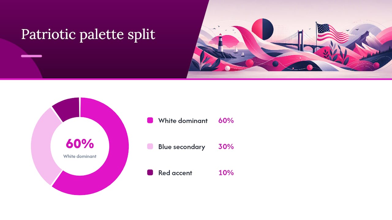
Red is the hardest of the three to get right. Pure fire-engine red reads cheap fast, so swap it for a brick or oxblood tone in anything larger than a small accent, think an accent wall, a trim stripe, or a textile pattern rather than a full garment. The same logic applies to blue: navy or slate reads more premium than royal blue in most contexts outside of flags and sports branding.
A few quick rules worth keeping on hand:
- Use warm off-white instead of stark white when you want the palette to feel lived-in rather than clinical.
- Test red-on-blue combinations for contrast and common color-blindness types before finalizing UI or signage work.
- Add outline or texture cues alongside color when conveying important information, never rely on red versus blue alone.
- Avoid placing saturated red directly against saturated blue with no white buffer; it can visually blend toward violet at a distance.
Pro Tip: Swap one primary for its muted cousin, brick for red, navy for blue, or ivory for white, and the whole palette instantly reads more designed than decorated.
Hex, RGB, CMYK, and Pantone Values for Production
Hex codes work for screens; CMYK and Pantone matter once you’re printing fabric, packaging, or signage. Pantone 1805 C is the standard reference for flag red, and Pantone 286 C covers flag blue, but muted variants like brick or navy won’t map cleanly to those numbers, so request a physical swatch before a full production run.
| Color | Hex | RGB | Nearest Pantone |
|---|---|---|---|
| Code Red | #B42033 | 180, 33, 51 | Pantone 1805 C |
| Royal White | #FEFEFE | 255, 255, 255 | N/A (near-white) |
| Pastel Dark Blue | #3C3B6E | 60, 59, 108 | Pantone 286 C |
| Vibrant Silver | #CECECE | 206, 206, 206 | Cool Gray 3 C |
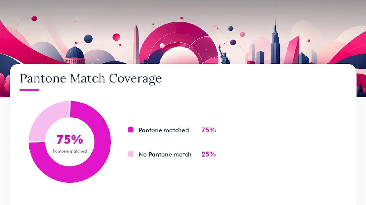
Some muted or blended palette shades lack a confirmed Pantone match, which is common once you move past the core flag tones. When that happens, order a physical Pantone bridge sample rather than guessing off a screen, since monitor calibration can shift a hex code’s actual printed appearance more than most designers expect.
Applying Patriotic Colors to Veteran-Focused Apparel
Put your dominant color on the main garment body and save red for logos, patches, or a single trim line, never the whole shirt. For embroidery, high-contrast thread against a neutral background (navy thread on ivory, or white thread on brick) holds up better at a distance than color-on-color stitching, and it photographs cleaner for product listings.
A respectful veterans’ event shirt usually works best with a muted base and one sharp accent color rather than a full flag reprint. Subtle trim on a hoodie, a piped collar in navy, a single red thread line, does more for perceived quality than an all-over pattern.
- Reserve bright red for small, high-impact areas: patches, stitched text, zipper pulls.
- Choose off-white or heathered gray over stark white for better wear and washability.
- Pair colors with natural fabric textures (canvas, heavyweight cotton) to reinforce an American-made feel.
Pro Tip: A single navy stitch line on a raw canvas hat reads more authentic than three colors competing for space.
A Designer’s Take on Patriotic Color
Authenticity beats literal flag mimicry every time; a palette rooted in a real setting, a porch, a parade route, a unit patch, holds up better than one built to look like a flag. For apparel meant to represent veterans, that distinction isn’t cosmetic. It’s the difference between a shirt that feels earned and one that feels like a costume.
Get Patriotic-Themed Apparel Without Designing It Yourself
If you’d rather wear one of these palettes than build it from scratch, Warbeardproject applies muted, veteran-appropriate red, white, and blue combinations directly to apparel built for the military community, so you skip the hex-matching and go straight to the finished product.
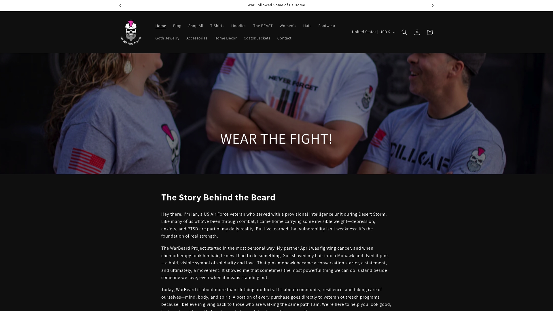
Warbeardproject’s red, white, and blue apparel line already applies the muted, 60:30:10 balancing rules covered above, so the patriotic accents read as intentional rather than seasonal. Custom color requests and product matching are available for teams building event or nonprofit merchandise, and a portion of every sale supports veteran outreach programs. Browse the new logo yoga leggings to see the palette applied to activewear, or check the full catalog for a piece that fits your project.
Frequently Asked Questions
What is the best patriotic color combination for branding? Classic American (#B42033, #FEFEFE, #3C3B6E) works best for logos and branding because it maps cleanly to Pantone 1805 C and 286 C, giving you consistent color across digital and print.
How do I keep a red, white, and blue palette from looking tacky? Swap saturated primaries for muted versions, brick instead of fire-engine red, navy instead of royal blue, and use a 60:30:10 ratio so no single color overwhelms the design.
What’s the difference between hex and Pantone for patriotic colors? Hex codes control screen display; Pantone numbers standardize color across print and fabric production. A hex value like #B42033 doesn’t guarantee a printed match without a Pantone or CMYK conversion.
Are there accessible patriotic color combinations for UI design? The Blue-Red-White Balanced set (#3C85C4, #EEF1F1, #CA565A) works well for UI, but always test contrast ratios and check how the combination reads for common color-blindness types before finalizing.
Can I use these palettes for apparel printing? Yes. Softer Patriotic and American Patriot both translate well to fabric since they avoid harsh primaries, and embroidery holds up better with muted tones against a neutral background.
Sources
- Schemecolor
- The Patriotic Palette: Red White and Blue Accents Without the Tacky
- Blue Red White Palette - Six Balanced HEX Colors | Eggradients
Always verify a Pantone or paint match against a physical swatch before committing to a full production run.